Project-1
Coffee Shop Analysis || Microsoft Excel

Welcome to my MS Excel project - the "Coffee Shop Dashboard"! In this endeavor, I delved into a dataset brimming with transaction records from a fictitious coffee shop nestled in the bustling streets of New York City.
The Goal:
The goal is to construct an intuitive and visually engaging dashboard that provides a comprehensive overview of the coffee shop's performance. This includes understanding transaction patterns over time, identifying key product categories, and enabling users to interactively analyze the data with the aid of slicers. Ultimately, the project seeks to empower decision-makers with a strategic tool for informed business analysis and performance evaluation.
Data Familiarization:
Unearth insights by understanding the basics: the number of recorded transactions and the temporal span covered. Dive into the products and their categories that found their way into the hands of eager customers.
Revenue Calculation:
Augmenting the dataset, I added a new column to dynamically calculate revenue, revealing the financial heartbeat of each transaction (price * quantity)
Temporal Insights:
Enhancing the dataset further, I introduced columns to decipher the temporal nuances: Extracted the month and day of the week from the transaction date.
Temporal Insights:
Enhancing the dataset further, I introduced columns to decipher the temporal nuances: Extracted the month and day of the week from the transaction date.
Temporal Breakdown:
Drilled deeper by adding a column to extract the hour from the transaction time.
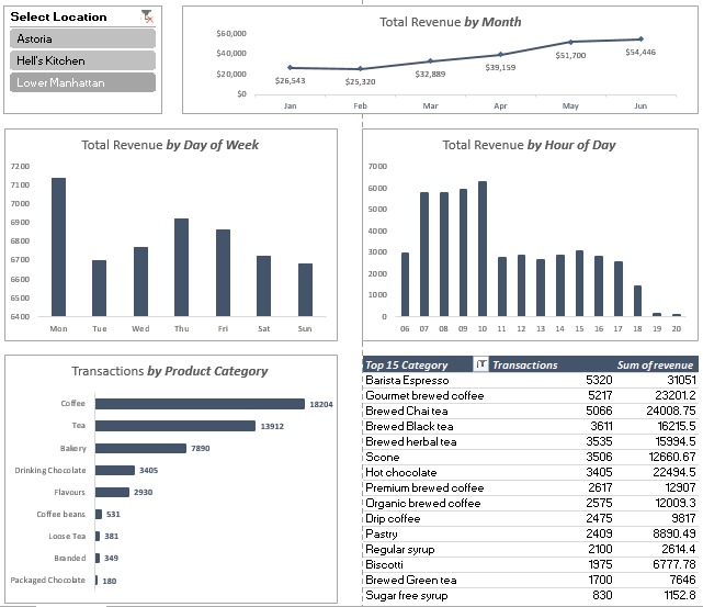
Pivotal Insights:
Transformed the dataset into actionable insights with PivotTables: Revenue breakdown by month. Transaction count by day of the week and hour of the day. Transaction count by product category, strategically sorted. Transactions and revenue breakdown by product type, showcasing the top 15 performers.
Visual Storytelling:
Crafted a narrative through Pivot Charts: Revenue evolution portrayed through a line chart by month. Transaction counts highlighted in column charts for both day of the week and hour of the day. Product category performance visualized as a bar chart.
Dashboard Assembly:
Merged these visual elements into a cohesive dashboard layout, creating a centralized hub for understanding the coffee shop's dynamics.
Slicer Integration:
Enhanced user interaction by incorporating a slicer for store location, dynamically linked to all PivotTables on the sheet.
Polish and Finalization
Fine-tuned the dashboard by hiding raw PivotTables, removing worksheet gridlines, and refining formatting for a professional touc
The Outcome:
In conclusion, what emerges is a comprehensive Coffee Shop Dashboard, offering a panoramic view of the business landscape over time. With the added functionality of slicers, one can effortlessly unearth store-specific insights and draw conclusions on performance trends across days and months. This dashboard is not just an aggregation of data; it's a strategic tool for decision-makers to navigate the nuanced terrain of coffee shop dynamics.